Nomenclature
QGIS: Quantum Geographic Information System
EPANET: A software application for modeling water distribution piping systems, developed by the United States Environmental Protection Agency (US EPA)
MSX: EPANET‑MSX (Multi‑Species eXtension) is a specialized extension to the EPANET hydraulic modeling engine that enables simulation of multiple interacting chemicals within water distribution systems.
DMA: District Metered Area
UI: User Interface
EPyT: EPANET-Python Toolkit, a Python package for simulating water networks using EPANET
GIS: Geographical Information System
INP File: Input file format used by EPANET for hydraulic model simulations
KIOS CoE: KIOS Research & Innovation Center of Excellence
Introduction
This manual provides a comprehensive guide to the dbpRisk 2.0 software application, offering users clear instructions for accessing and utilizing the tool’s functionalities.
The document begins with an overview of the IntoDBP project, followed by step-by-step guidance on how to install the application and navigate the user interface. Users are guided through configuring the mechanistic model and using scenario builder and simulator. The document also explains how to explore simulation results. It concludes with a practical use case. This manual is designed to support both new and experienced users in effectively applying dbpRisk 2.0 for decision-making and analysis.
IntoDBP is an EU-funded project that will develop, test, scale-up, validate, and benchmark innovative tools and strategies to improve water quality management for safe human use and a healthy environment. It focuses on catchment protection and forecasting, transformative drinking water treatment, and real-time monitoring to combat the effects of climate and global change.
In particular, the project aims to develop a comprehensive approach from source to tap for an optimum drinking water surveillance strategy, to foster AI sensor deployment methodologies and algorithms in water distribution networks (WDN) and create a new open and ready-to-use workflow using a combination of dynamic and statistical models. In addition, it aims to increase the understanding of human exposure, to generate and implement models and recommendations to impact policy and decision-making in Europe, as well as to provide guidance to decision makers to formulate optimized and future-proofed climate change adaptation pathways to successfully tackle emerging water quality threats.
The project will develop its cross-cutting solutions on 4 complementary case studies combining rural and dense urban areas, from 3 European countries (Spain, Cyprus, and Ireland), where disinfection by-products (DBPs) are a scientific, technological, and political challenge.
The consortium consists of 16 partners from Europe, including researchers, small and large enterprises, communication experts, and public services. On behalf of the University of Cyprus, NIREAS International Water Research Center and KIOS Center of Excellence are participating as project partners.
The KIOS research team contributes to the project’s outcomes by implementing dbpRisk 2.0 application, a mathematical and modelling tool for the formation of DBPs, and for investigating strategies for optimal control and minimization of their formation risk. This tool represents a significant advancement in the field of water quality management for safe human use.
To make effective use of the dbpRisk 2.0 application, users are guided through a series of structured steps. These are detailed in the following sections of this manual and include:
Installation: Set up the application and its dependencies.
Selection of the hydraulic model: Choose a hydraulic model from the available options.
Selection of the water quality/chemical reaction model: Define the water quality model based on MSX configuration.
Mapping through GIS maps: Visualize the network on the map.
Data fetching from Excel Files: Import sensor and sampling data locally.
Data fetching from API: Retrieve data using credentials from remote sources.
Data manager: Manage and organize input files via local or remote access.
Calibrate and validate models: Use real measurements to refine model accuracy.
Application of What-if Scenarios through a “Scenario builder” app: Define actions such as injections, initial concentrations, and parameter variations.
Scenario simulator: Run the scenario to simulate system response under selected conditions.
Model outputs through a “Results explorer” app: Visualize outputs through maps and plots for informed decision-making.
Installation Instructions
dbpRisk 2.0 is a QGIS plugin developed to simulate the formation of DBPs in WDNs. QGIS is a free and open-source GIS platform used worldwide for creating, editing, and analyzing spatial data. It supports a wide variety of formats and offers a flexible plugin architecture, making it ideal for developing specialized tools like dbpRisk 2.0. By building dbpRisk 2.0 as a QGIS plugin, we enable users to integrate risk models with geospatial data seamlessly, perform advanced spatial analyses, and produce clear visual outputs - all within a single interface. To install dbpRisk 2.0, users first need to install QGIS from its official website here.
After launching QGIS, the plugin can be added via the Plugins > Manage and Install Plugins menu (Figure 1).
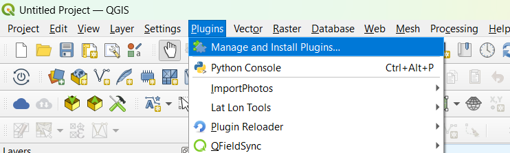
Figure 1: Installing the dbpRisk 2.0 plugin in QGIS
In the plugin manager window, search for dbpRisk 2.0, then select it from the list and click Install Plugin, as shown in Figure 2. Note that, from Plugins, you can install the open-source version of the plugin.
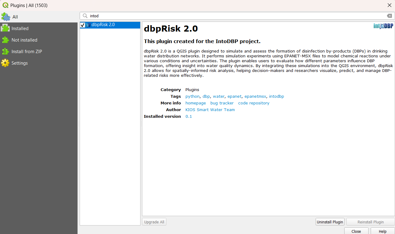
Figure 2: Select plugin and install
IntoDBP partners have the option of installing a version of the toolkit that includes network models and data from the IntoDBP project. This can be done using a .ZIP file which is shared privately among partners. Partners should go to the Install from ZIP (Figure 3) option and load the shared .ZIP file.
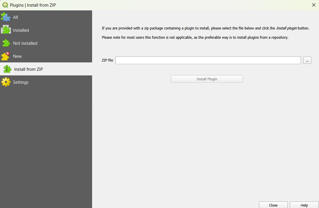
Figure 3: Installation of dbpRisk 2.0 in QGIS using a .ZIP file
Once installed, the plugin will appear in the QGIS interface and can be accessed from the corresponding menu (Plugins) or from a toolbar in the interface (Figure 4). Users can move the toolbars to customize the QGIS user interface as desired.
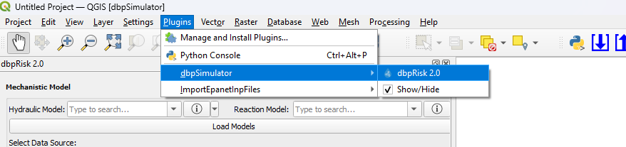
Figure 4: Loading the installed dbpRisk 2.0 plugin in QGIS
Operating system requirements
Below you can find the operating system requirements for running QGIS and the plugin:
Minimum Requirements
Operating System: Windows 10 (64-bit), macOS 10.14+, or a modern Linux distribution
Processor: Dual-core CPU (e.g., Intel Core i3 or AMD equivalent)
RAM: 8 GB
Storage: 10 GB available disk space for installation (additional space needed for data)
Graphics: OpenGL 3.2 compatible graphics card
Screen Resolution: 1366x768
Recommended Requirements
Operating System: Windows 11 (64-bit), macOS Monterey or later, Ubuntu 22.04+
Processor: Quad-core CPU (e.g., Intel Core i5/i7 or AMD Ryzen 5/7)
RAM: 16 GB or more (especially for large datasets or complex analysis)
Storage: SSD with at least 10 GB free space
Graphics: Dedicated GPU with at least 2 GB VRAM (NVIDIA/AMD)
Screen Resolution: 1920x1080 or higher
User interface
The user interface of the dbpRisk 2.0 application is presented in Figure 5. This interface represents a fully integrated simulation environment for modeling and analyzing water quality in a WDN, using QGIS.
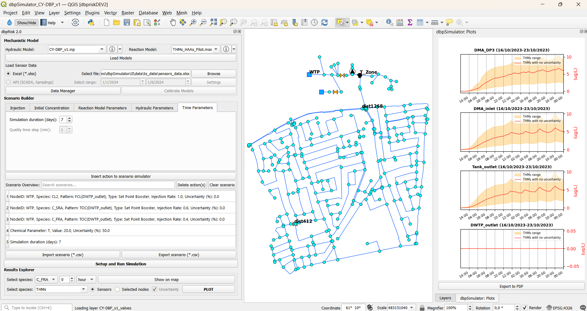
Figure 5: User interface
The menu bar (see Figure 6) contains standard QGIS options such as: Project, Edit, View, Layer, Settings, Plugins, Vector, Raster, Database, Mesh, Processing, and Help. These menus provide access to essential GIS functions including map management, layer operations, plugin integration, and data processing.

Figure 6: Menu bar
The toolbar (Figure 7) provides quick access to common tools and actions, such as navigation tools (zoom, pan, select), layer controls, attribute table viewer, map saving/exporting tools, plugin controls including access to the custom dbpRisk 2.0.

Figure 7: Toolbar
The custom dbpRisk 2.0 plugin is organized into the following sections (Figure 8):
Mechanistic model
Scenario builder
Setup and Run Simulation
Results explorer
The map view displays the WDN overlaid on a geographic map, with nodes and links clearly visualized. The plot panel presents time series plots of simulated values for selected species at sensor locations and selected nodes.
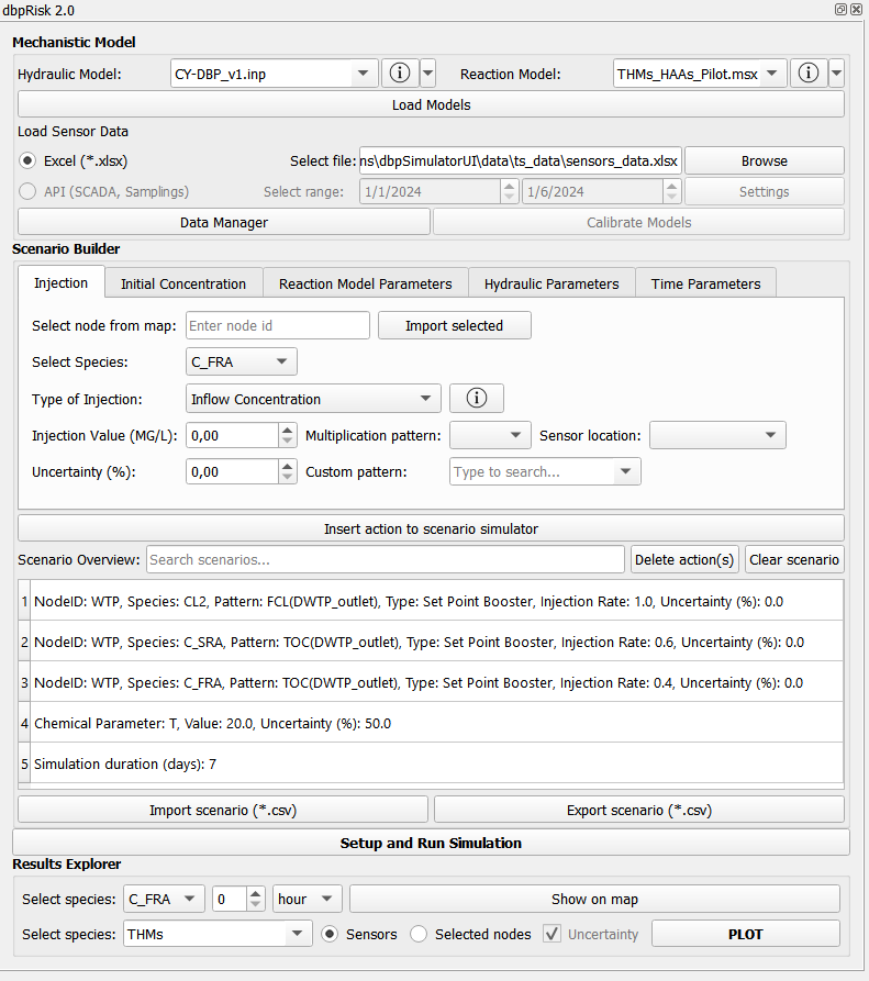
Figure 8: Main interface
Mechanistic model
The mechanistic model configuration interface, shown in Figure 9 includes:
Selection of hydraulic and reaction models
Button to load models onto the map
Option to choose data source (excel or API)
File browser to select excel data file
Data manager access
Model calibration button (currently disabled)
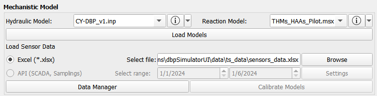
Figure 9: Mechanistic model configuration interface
Select hydraulic model
Initially, the user can select a hydraulic model (EPANET file) from a dropdown list or by selecting the option IMPORT FILE, you can import your own EPANET input file (Figure 10).
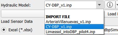
Figure 10: Select hydraulic model
By clicking the corresponding information button (Figure 11), detailed information about the selected model can be accessed, as shown in Figure 12. Additionally, the user can open the model on the EPANET GUI (Figure 13) or in a notepad.
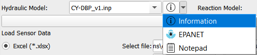
Figure 11: Hydraulic model Information, EPANET, Notepad buttons
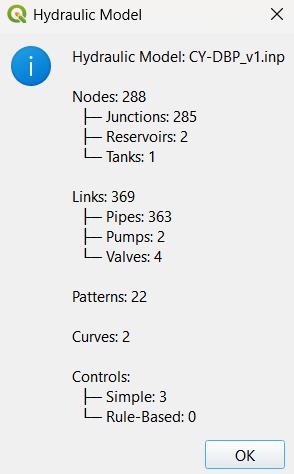
Figure 12: Hydraulic model information
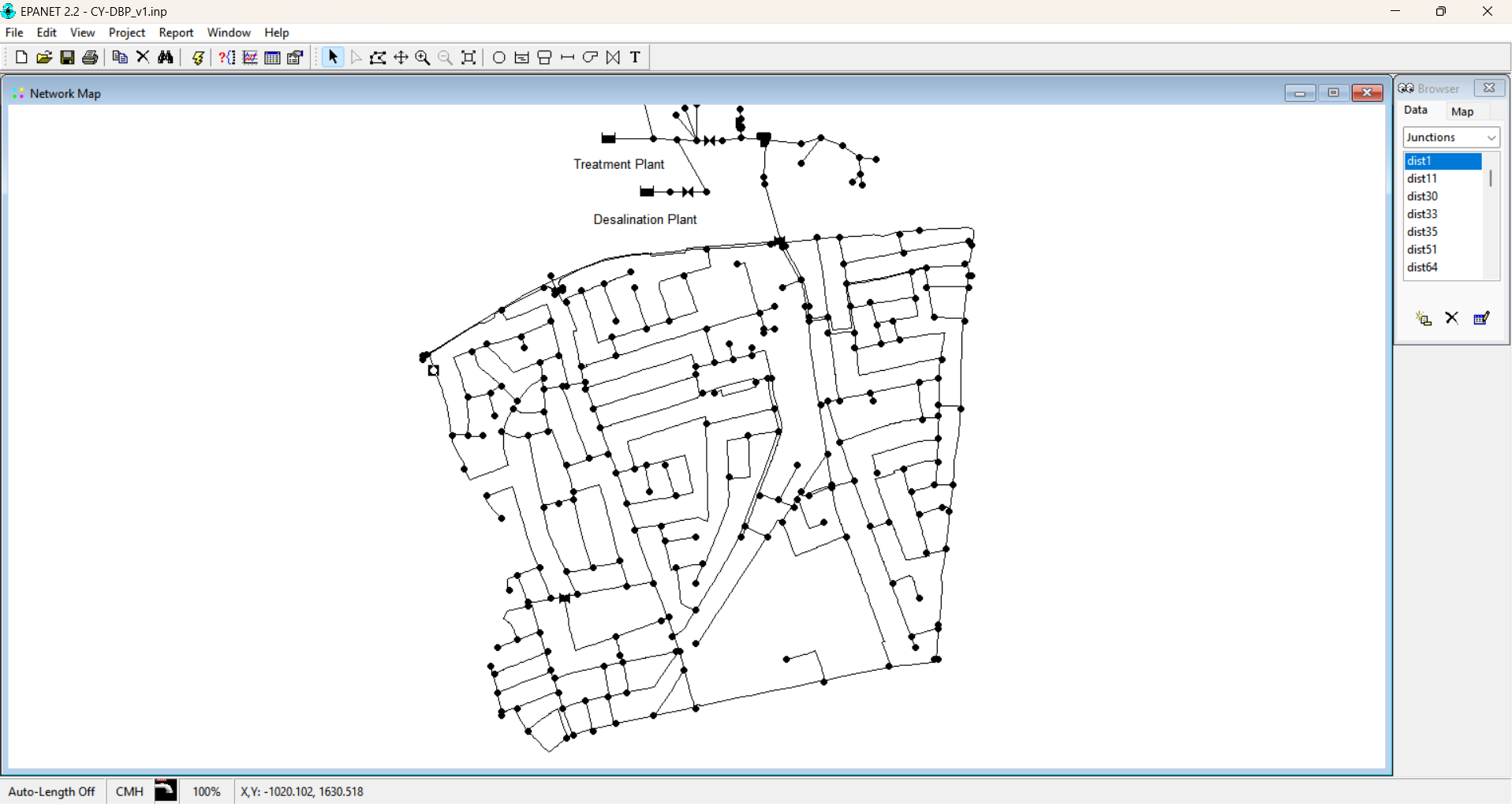
Figure 13: View network in EPANET
Select reaction model
After that, the user can select a reaction model (MSX file) from a dropdown list (Figure 14).
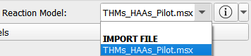
Figure 14: Select reaction model
By clicking the corresponding information button (Figure 15), the selected MSX file is opened, allowing the user to view the detailed configuration of the reaction model, as shown in Figure 16. Users can also prepare their own MSX files by following the same structure as the provided using the option IMPORT FILE.
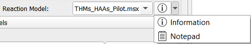
Figure 15: Reaction model Information and Notepad buttons
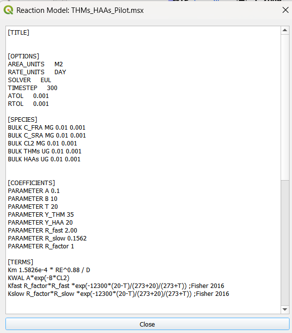
Figure 16: Selected MSX file
Load GIS on map
After selecting the hydraulic and reaction models, the user can load the associated GIS data onto the map by clicking the ‘Load Models’ button (Figure 17).

Figure 17: Load models
The corresponding network elements then appear on the map for visualization and interaction, as shown in Figure 18.
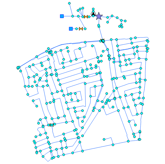
Figure 18: Map view displaying the loaded GIS data
Fetch data from excel files
The user can select an excel file containing sensor data (e.g., conductivity, FCL, temperature, pH, etc.) for further processing, as shown in Figure 19.
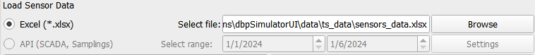
Figure 19: Load sensor data
Fetch data from API
Alternatively, data can be retrieved from the API by providing valid user credentials (username and password). If the API option is selected, the user can also specify the desired data period for retrieval (Figure 20). This option is currently not available but is planned for implementation in a future version.

Figure 20: Select API
Data manager
By clicking the ‘Data Manager’ button (Figure 21) the user can search for specific data files, either by selecting excel files locally or - once available - by providing a URL (e.g., from Zenodo) for remote data access. The latter option is currently not available but is planned for implementation in a future version.

Figure 21: Data manager button
Calibrate and validate models
The hydraulic and water quality models can be calibrated and validated using real-world measurements obtained from field sensors and sampling results, by clicking the ‘Calibrate Models’ button (Figure 22). These data can be imported via excel files or retrieved through APIs for calibrating models. This option is currently not available but is planned for implementation in a future version.

Figure 22: Model calibration button
Scenario builder
Figure 23 shows the scenario builder interface, which supports the following actions:
Injection
Initial Concentration
Reaction Model Parameters
Hydraulic Parameters
Time Parameters
The developed software enables users to simulate what-if scenarios including various conditions, uncertainties and considering climate change to assist in the decision-making process.
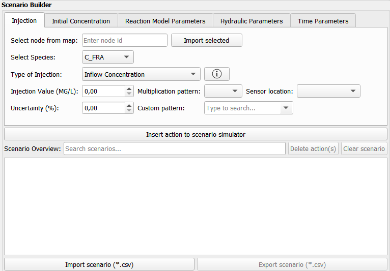
Figure 23: Scenario builder interface
Injection
Injection action include a node ID, available species (based on the MSX file), the type of injection, an injection value and its uncertainty, as shown in Figure 24.
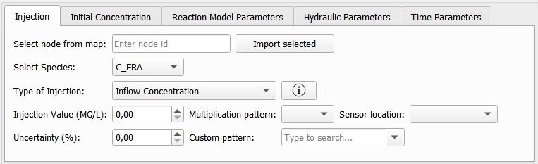
Figure 24: Injection parameters
The user can select a node directly from the map and by clicking ‘Import selected’ button the corresponding node ID is captured and defined for use in scenario builder.
Supported injection types include inflow concentration, mass inflow booster, set point booster and flow paced booster (Figure 25). More details for each injection type can be found in the EPANET manual.
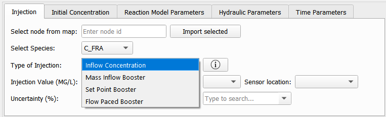
Figure 25: Injection types
Initial concentration
Initial concentration action includes the node ID, available species (based on the MSX file) and an initial concentration value and its uncertainty, as shown in Figure 26.
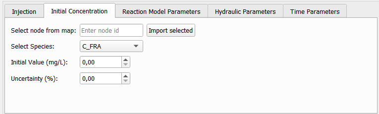
Figure 26: Initial concentration parameters
The user can select a node directly from the map and by clicking ‘Import selected’ button the corresponding node ID is captured and defined for use in scenario builder.
Reaction model parameters
Reaction model parameters’ actions include parameters based on the MSX file, their values and uncertainty, as shown in Figure 27.
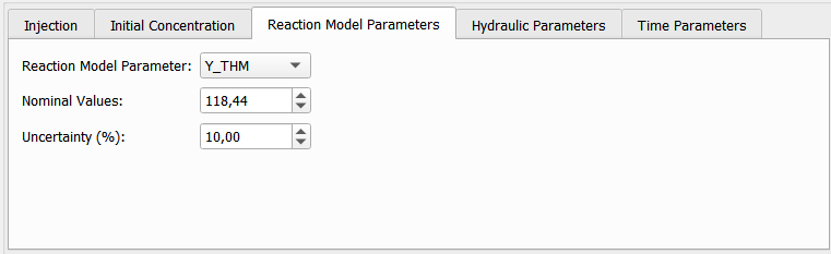
Figure 27: Reaction model parameters
Hydraulic parameters
Hydraulic parameters scenarios include demand uncertainty, as shown in Figure 28. A number of Monte Carlo simulations can be also defined by the user.
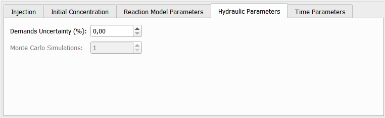
Figure 28: Hydraulic parameters
Time parameters
In this tab, users can set the simulation duration (e.g. 7 days) (Figure 29).
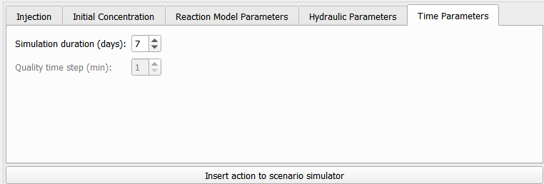
Figure 29: Time parameters
Insert action into the scenario simulator
The user can select the desired parameters of each type to build an action and then insert the desired action to the scenario simulator box, by clicking the ‘Insert action to scenario simulator’ button (Figure 30).
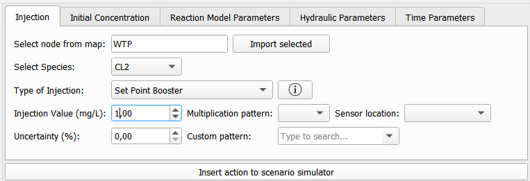
Figure 30: Insert action into scenario simulator
Figure 31 shows the scenario overview which provides a list of all configured actions. Users can manage actions using the ‘Delete action’ or ‘Clear scenario’ buttons, import/export scenarios, and search for any word to display actions containing the searched word.
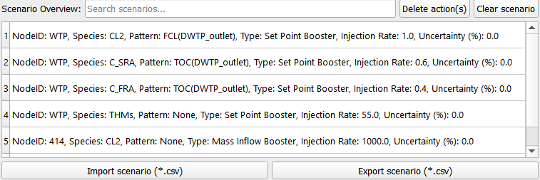
Figure 31: Scenario simulator interface
The user has the flexibility to manage the configured scenario by removing individual actions or clearing all actions entirely. A specific action can be deleted by clicking the ‘Delete action’ button (Figure 32), while the ‘Clear scenario’ button removes all actions from the scenario simulator (Figure 33). A confirmation warning is displayed before any deletion is finalized, ensuring that the user explicitly confirms the removal of actions.
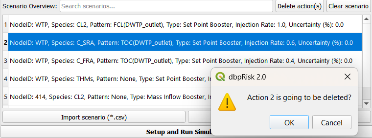
Figure 32: Delete action
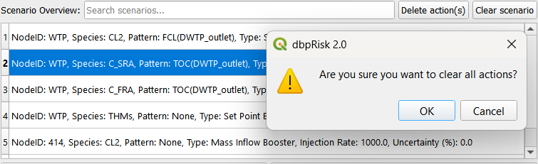
Figure 33: Clear scenario
Alternatively, a predefined scenario can be imported directly from a CSV file by clicking the ‘Import scenario’ button (Figure 34), enabling faster setup and reuse of previously configured scenarios.

Figure 34: Import scenario button
The user can also export the configured scenario as a CSV file by clicking the ‘Export scenario’ button (Figure 35). This feature supports scenario sharing and future reuse.

Figure 35: Export scenario button
Scenario simulator
In this section, once all desired actions have been added and retained in the scenario simulator box, the user can simulate the what-if scenario to support decision-making by clicking the ‘Setup and Run Simulation’ button (Figure 36). In the time parameters, the user can change the simulation duration and run it again without needing to add it in the scenario overview.

Figure 36: Setup and Run Simulation button
Results explorer
Figure 37 shows the results explorer interface, which allows users to:
Select species
Choose a specific hour (the range depends on the defined simulation duration) to view data for a particular simulation time
Click the “Show on map” button to display the corresponding values on the map
Select one or two species to plot at either sensor locations or selected nodes
Use the “PLOT” button to generate visualizations
The “Include Samplings (API)” checkbox is currently disabled but is planned for future implementation.
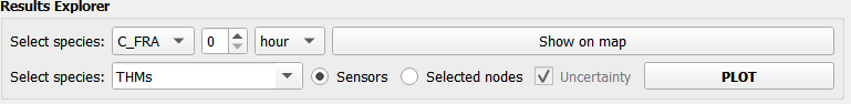
Figure 37: Results explorer interface
The user can select a species from a dropdown list (Figure 38), choose the hour option (Figure 39) and specify a particular hour from a dropdown list.
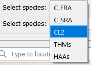
Figure 38: Select species
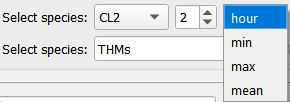
Figure 39: Choose hour option
By clicking the ‘Show on map’ button (Figure 40), the corresponding simulated values can be visualized on the map for that specific time, as shown in Figure 41. When hovering the mouse over a junction, the species name and its simulated value are displayed.

Figure 40: Show on map button
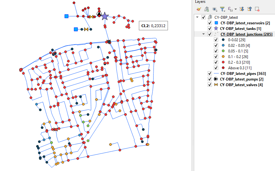
Figure 41: Simulated values on map
Additionally, the platform allows the display of the minimum, maximum and mean values of these species over the simulation period, by selecting the appropriate option from the dropdown list (Figure 42).
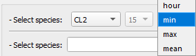
Figure 42: Show minimum values
The user can select one or two species (Figure 43), select Sensors and by clicking the ‘PLOT’ button (Figure 44) the simulated species at sensor locations can be visualized, as shown in Figure 45.
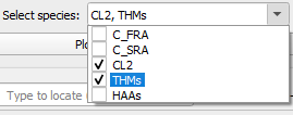
Figure 43: Select species

Figure 44: Plot species at sensor locations
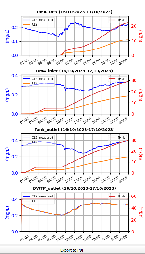
Figure 45: Plots of species at sensor locations
The user can also select nodes directly from the map, choose the “Selected nodes” option and by clicking the ‘PLOT’ button (Figure 46) the simulated species at these nodes can be visualized, as shown in Figure 47.

Figure 46: Plot species at selected nodes
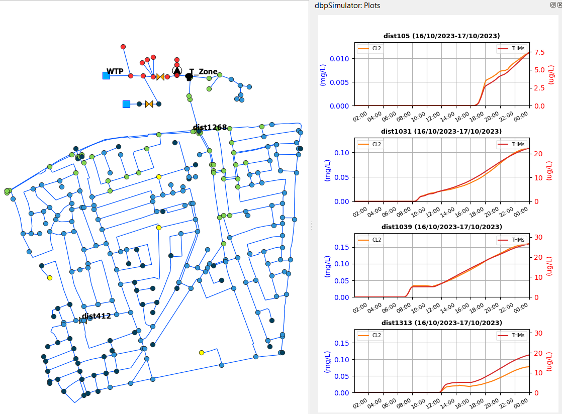
Figure 47: Plots of species at selected nodes
Use case
This section guides the user through a complete example of how to use dbpRisk v2.0. It includes each major step, loading models and configuring a scenario to simulating and visualizing results, offering a hands-on demonstration of the tool in action.
First, select a hydraulic model from the dropdown list - e.g., CY-DBP_v1.inp (Figure 48).

Figure 48: Select hydraulic model
Then, select a reaction model from the dropdown list - e.g., THMs_HAAs_Pilot.msx (Figure 49).

Figure 49: Select reaction model
After selecting the hydraulic and reaction models, load the associated GIS data onto the map by clicking the ‘Load Models’ button (Figure 50).

Figure 50: Load models
The corresponding network elements then appear on the map for visualization and interaction, as shown in Figure 51.

Figure 51: Map view displaying the loaded GIS data
Select an excel file containing sensor data - e.g., sensors_data.xlsx (Figure 52).

Figure 52: Load sensor data
Subsequently, configure the required parameters for each selected action type. Once configured, insert the defined action into the Scenario Overview by clicking the “Insert Action to Scenario Simulator” button.
Scenario: Limassol Case Study
We present the following scenario that considers chlorination at the Water Treatment Plant (WTP) and rechlorination at the “Zone 2” Tank. Chlorination at the WTP is represented by directly utilizing sensor data at the outlet of the station, with TOC selected as the Reacting Agent that represents Natural Organic Matter (NOM). The injected concentration at each time step equals the defined “injection rate” multiplied by the corresponding pattern value. If the loaded pattern represents the actual concentration and not a pattern with multipliers, then the “injection rate” should be set to 1.
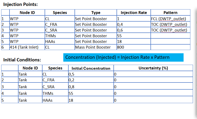
Figure 53: Disinfection scenario with chlorination at the Limassol Case Study
Scenario actions were considered in the platform, as shown in the figures below:
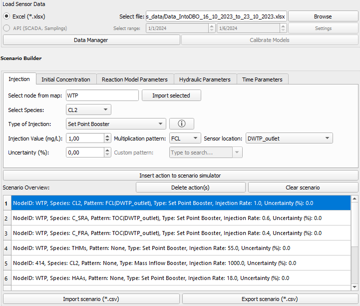
Figure 54: Defined actions (injected species) of the disinfection scenario for the Limassol Case Study
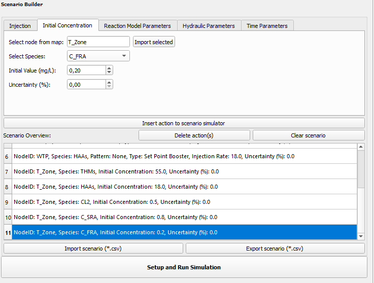
Figure 55: Defined initial conditions for the Limassol Case Study scenario
Define the simulation duration in days (e.g., 7) as shown in Figure 56.
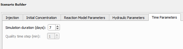
Figure 56: Select simulation duration
After adding all the desired actions to the Scenario Simulator and specifying the simulation duration, initiate the simulation by clicking the “Setup and Run Simulation” button. (Figure 57).

Figure 57: Setup and Run Simulation button
Once the simulation has been completed, select a species from the dropdown list (e.g., CL2), choose the hour option and specify a particular hour from the dropdown list (e.g., 165) as shown in Figure 58.

Figure 58: Select species and hour
By clicking the ‘Show on map’ button, the corresponding simulated values are visualized on the map for that specific time, as shown in Figure 59.
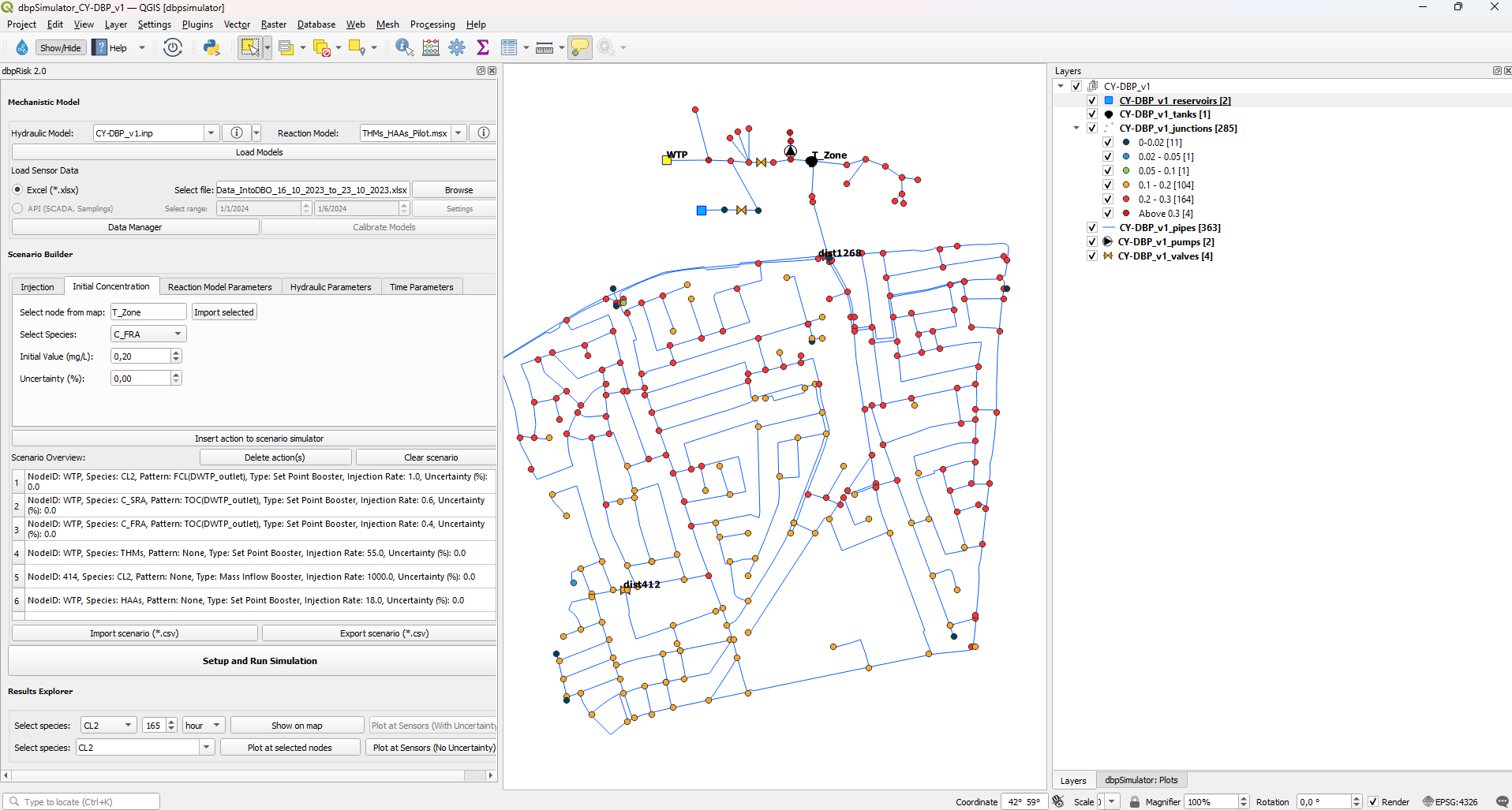
Figure 59: Simulated chlorine concentration values plotted on map for a specific time
Additionally, the platform allows the display of the minimum, maximum and mean values of the selected species (e.g. THMs) over the simulation period, by selecting the appropriate option from the dropdown list – e.g. max (Figure 60).

Figure 60: Select maximum values
By clicking the ‘Show on map’ button, the corresponding simulated values are visualized on the map, as shown in Figure 61.
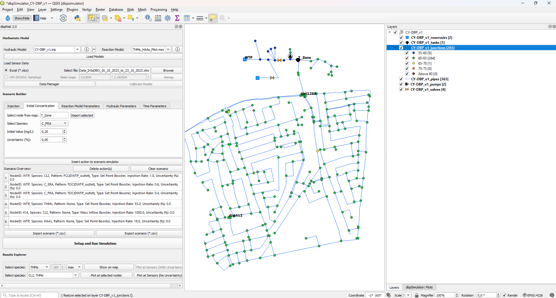
Figure 61: Simulated THMs max values on map
Select one or two species -e.g. CL2, THMs (Figure 62) and by clicking the plot species at sensor locations (Figure 63) the simulated species at sensor locations are visualized, as shown in Figure 64.
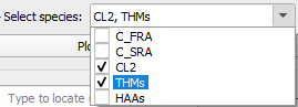
Figure 62: Select species

Figure 63: Plot species at sensor locations
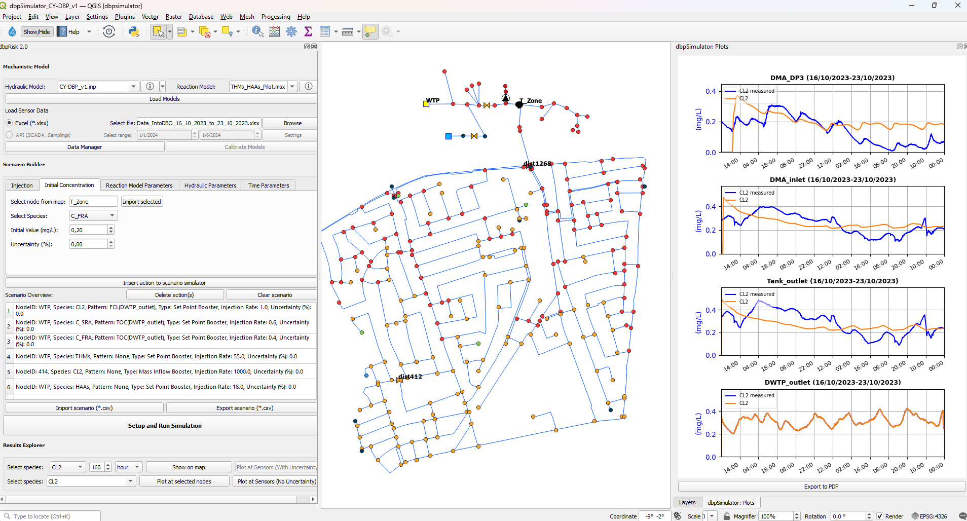
Figure 64: Plots of species at sensor locations compared to the corresponding field sensor data
Further, by selecting random nodes directly from the map and by clicking the plot species at selected nodes (Figure 65) the simulated species at these nodes are visualized, as shown in Figure 66.

Figure 65: Plot species at selected nodes
Figure 66: Plots of species at selected nodes
Scenarios with uncertainties:
The proposed tool provides the ability to consider uncertainties in all model parameters. Currently, only one parameter with uncertainty can be considered at a time, allowing the user to assess the model’s sensitivity to that specific parameter. Below is an example of two scenarios involving parameter uncertainty, along with the corresponding results. For each simulation, the maximum and minimum bounds for each species are plotted, reflecting the range of variation resulting from the considered parameter uncertainty.
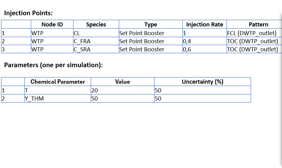
Figure 67: Disinfection scenario with uncertainties at the Limassol Case Study
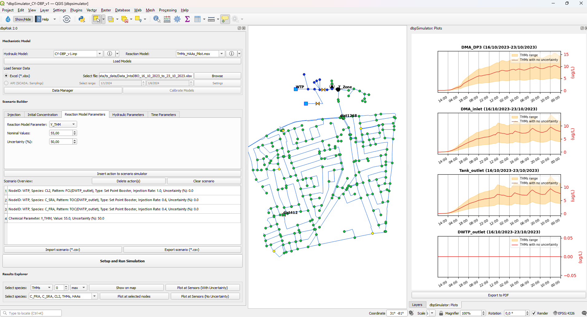
Figure 68: THMs concentration timeseries with uncertainty bounds concerning the THM Yield coefficient
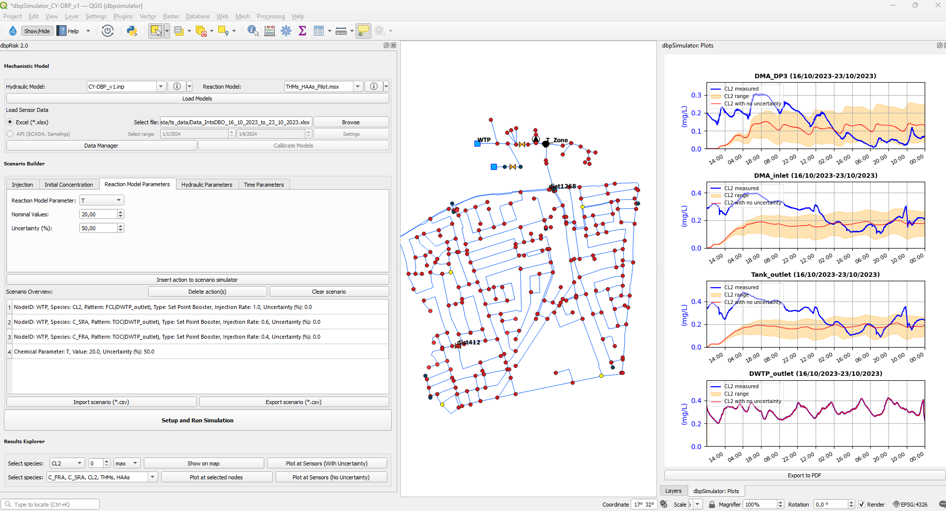
Figure 69: Chlorine concentration timeseries with uncertainty bounds concerning the Temperature